Through several of our blog posts, we've provided tips for how to best design your home. Whether it's how to choose paint colors, incorporate architectural antiques, or select artwork, there are a lot of factors and elements that can help make your home just the way you want it. But, along with things you can do to help the overall look and feel of a space, there are also things you should avoid when it comes to the interior design of your home.

Here are ten common interior design blunders and a few words of wisdom on how you can avoid making the same mistakes.
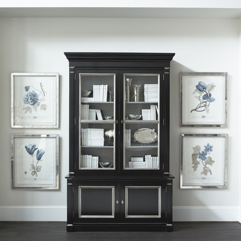
1. Overaccessorizing. Just because it stands still doesnt mean you have to put something on it. Overcrowding a space with artwork and accessories can make a beautiful design appear to be a storage room. Accessories to a room are like jewelry to an outfit. Less can be more. Keep your accessories well edited and mix different types of materials for a more interesting look. Use books, glass hurricanes, picture frames and objects in groupings on coffee tables, end tables and bookshelves. But, be keenly aware of when you have enough.
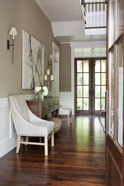
2. Hanging artwork too high. Dont hang your artwork too high or use pieces that are inappropriately sized for the space. Artwork should be hung at a height where people can view and enjoy it (i.e. eye-level). It should also be selected proportionally for the wall on which it will hang and/or for any furniture piece(s) over which it will hang. Artwork that is too high or too small will look odd and take away from your overall room design.

3. Using faux greenery. Don't use faux greenery. Not on top of cabinets, on open shelves, or in any kind of container that attaches to a wall! If you dont have the time or desire to take care of real plants, then the space is better served by some other accessory. If your objective is to bring the outdoors in or to introduce living elements, faux plants will not create this environment. Disclaimer: There are some natural botanical reproduction options if you strongly wish to use a forever plant." Be sure to check out our botanical collection in our online boutique for a variety of options to consider.
4. Faux finishing. Leave faux finishing to the professionals. Do-it-yourself faux finishes (whether on walls, countertops, floor surfaces, furniture, etc.) often come across looking crafty and dated. A professional has access to different products, tools, and training. Their results will be more subtle and lasting (something youll not get tired of). If a faux finisher is not in your budget, a more lasting solution would be to freshen up with a new coat/color of paint and add interest in other ways (e.g. artwork, accessories, window treatments, etc.) as you are able.
5. Using and incorporating every design idea. Dont try to use every design idea or component that you love in one space. Though you may like your neighbors kitchen design, the cool chandelier you saw in Elle Décor, the great tile at the local tile shop, the bold granite your friend used in her powder room, and the fabric your sister found on sale and stocked for you doesnt mean that it all needs to go in your kitchen. Trying to use too many bold and active components in one space can be overwhelming if you want to feature something, then make it the feature and let the other components be a backdrop. This will require being able to rank your wants in terms of priority and location and also placing trust in your designer to provide you with the type of environment you are seeking to produce.

6. Over using rugs. Unlike what some may think, you don't need to cover every square inch of your gorgeous hardwood floors with rugs. Use them to define key areas such as seating arrangements, dining tables, bedrooms, etc. You do not need a runner/small area rug on every exposed surface. Let those beautiful hardwoods stand on their own.
7. Mixing too many patterns. You have to be careful when mixing patterns. Dont use more than one bold pattern because the patterns will compete for visual attention. Pick one pattern you love and select fabrics and simple designs to pair with it. This will allow your primary pattern to be the center of attention and your remaining decorative elements and fabrics to further complement it instead of compete with it.
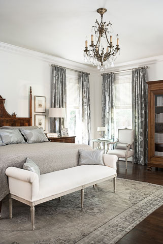
8. Hanging drapery rods and draperies directly above window casings. Instead of hanging draperies directly above window casings, always hang drapery rods as high above the window casing as possible. In a room with a flat ceiling, hang draperies directly under the crown moulding. If you are using store-bought drapes then always buy them longer than you need and have them hemmed for a custom look. Make sure they touch and break slightly at the floor. These tricks make your room look more graceful and give the appearance of higher ceilings.

9. Painting every room a different color. It's unnecessary to paint each room in your home a different color. Keeping the rooms in your house the same color or in the same family of colors helps your house flow visually. Also, don't neglect the ceilings. An interesting faux finish, wallpaper or paint color can make a room feel extra special. Ceiling treatments can be an effective element in powder rooms, bedrooms, and dining rooms.
10. Skipping the space planning. It is important to measure and get a good understanding of your space in order to purchase furnishings that are the right scale. Keep a copy of a scaled floor plan with you as you shop for furnishings. Size can be very deceiving when looking at furnishings in large stores. Scale is also very important when it comes to selecting lighting. Understand your limitations such as room dimensions and ceiling heights.
Have you been guilty in the past of one of these blunders?
If you are interested in giving your home a fresh new look, be sure to contact one of our designers to help you avoid some of the most common interior design mistakes and transform your home into something truly spectacular.
Photos by: Rachael Boling
