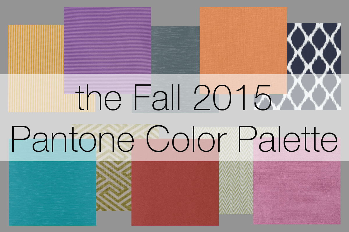
Fall has finally arrived and that means it's time to incorporate Pantone's new Fall 2015 color palette into your home. This season's selections include the color of the year, Marsala, and nine new fall colors to mix into your home decor and fashion this season. We thought we'd get you started by introducing you to the lineup and pulling a coordinating fabric that could evoke these colors if used in your home.
 One of the best parts of Pantone's fall colors is that they can be pulled into any part of your design. Something to remember, however, is that when incorporating trending colors like these, it can be easier to use them as accent colors, leaving larger pieces like sofas, rugs, and walls as neutral backdrops. This makes changing colors for the next season a little easier.
To celebrate this new combination of colors for the season, we've gathered a few fabrics from one of our fabric houses, Duralee. This fabric company has been creating and fine tuning their fabric selections for more than 80 years. We use Duralee fabrics for all kinds of projects, from covering furniture to making window treatments. Explore this season's palette with these colorful fabrics below.
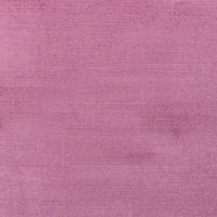
Cashmere Rose A gentle, refined pink, Cashmere Rose adds a cheerful pop to the fall 2015 color palette. An easy way to pull this soft hue into your design is Duralee's 36168-124 Blush from their Sedona Velvet collection.
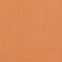
Cadmum Orange Despite its subtle color, this orange will draw the eye in your fashion choices or home design. This playful orange could be drawn into your design with Duralee's fabric 36262-34 Pumpkin.
Amethyst Orchid For a bold, organic purple in your design, look no further than Amethyst Orchid. This vibrant color can be found in Duralee's 15384-204 Amethyst. 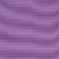
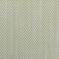
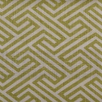
Desert Sage This muted, natural green allows you to pull in a calming touch in your design and pairs well with the three bright, floral colors above. This unobtrusive neutral can be found in Duralee's 32674-579 Peridot.
Reflecting Pond A dark cool blue, this color acts as a sophisticated neutral. Duralee's 36301-5 Blue is a beautiful example of this color used in a tasteful pattern. 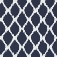
Biscay Bay This subdued blue can provide cool tones to your home's palette. This soothing, tranquil color is visible in Duralee's 32730-260 Aquamarine faux silk fabric. 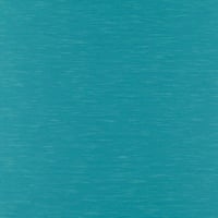
Oak Buff A warm golden yellow, this color continues the palette's call to nature. The mellow feel of this color is found in Duralee's 32645-265 Corn. 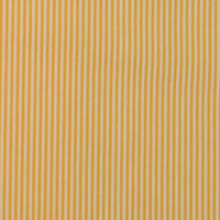
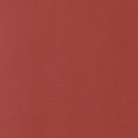
Marsala This beautiful wine red is the color of the year. A rich, red-brown, Marsala's warmth is reflected in Duralee's 90949-707 Tomato fabric.
Dried Herb A gentle, natural color reminiscent of Italian spices, Dried Herb naturally pairs well with Marsala's red-brown hue. This color can easily be added to your home's textiles with a little bit of Duralee's 42271-254 Spring Green.
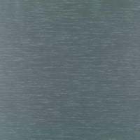
Stormy Weather We at Postcard from Paris are known for our love of using a wide variety of grays. This dramatic, dark gray, reminiscent of an overcast sky, features blue undertones. Duralee's faux silk 32730-11 Turquoise captures the power of this season's stormy gray.
We hope this look at Pantone's new palette gives you the inspiration you needed to kick off your home's transition to fall. What do you think of this season's palette? How do you plan on using these colors this season?
For more help bringing the new season into your design, check out our Fall Design Guide.